

I never imagined that a web design project could become an emotional, almost literary journey. But that is how it all began: with the task, and the privilege, of designing the website for the Centro Gabo, a space dedicated to honoring the life, work, and legacy left by Gabriel García Márquez. And as if it were one of his stories, the challenge arrived wrapped in urgency: we had to create it in record time.
The call of magic
Every good UX project begins with a deep understanding of the user and the content. Before thinking about colors or interfaces, I decided to do the most important thing: go back to Gabo's roots—to Macondo, to the Caribbean, to that territory where the everyday blends with the fantastic. I remembered Gabo's warmth, his curious gaze, his calm voice, and that gift for turning life into an unforgettable tale.
I knew that for the design to work, I had to feel that world first. To translate it without breaking the magic.
The symbols that began to speak to me
The UI work relied on symbols loaded with history and emotion; as I researched, they appeared almost on their own, as if they were looking for me: the delicate, eternal fountain pen, a symbol of his writing. The "sombrero vueltiao," proud and deeply Caribbean. The sun, always warm, always present. The wings, recalling that flight between the real and the impossible. The yellow butterfly, inevitable, poetic, inseparable from his work. The vintage camera, a witness to his passion for cinema.
Each one became a piece of the visual puzzle. I didn't choose them for aesthetics, but for meaning: to reinforce the site's identity and create an emotional connection with the user.
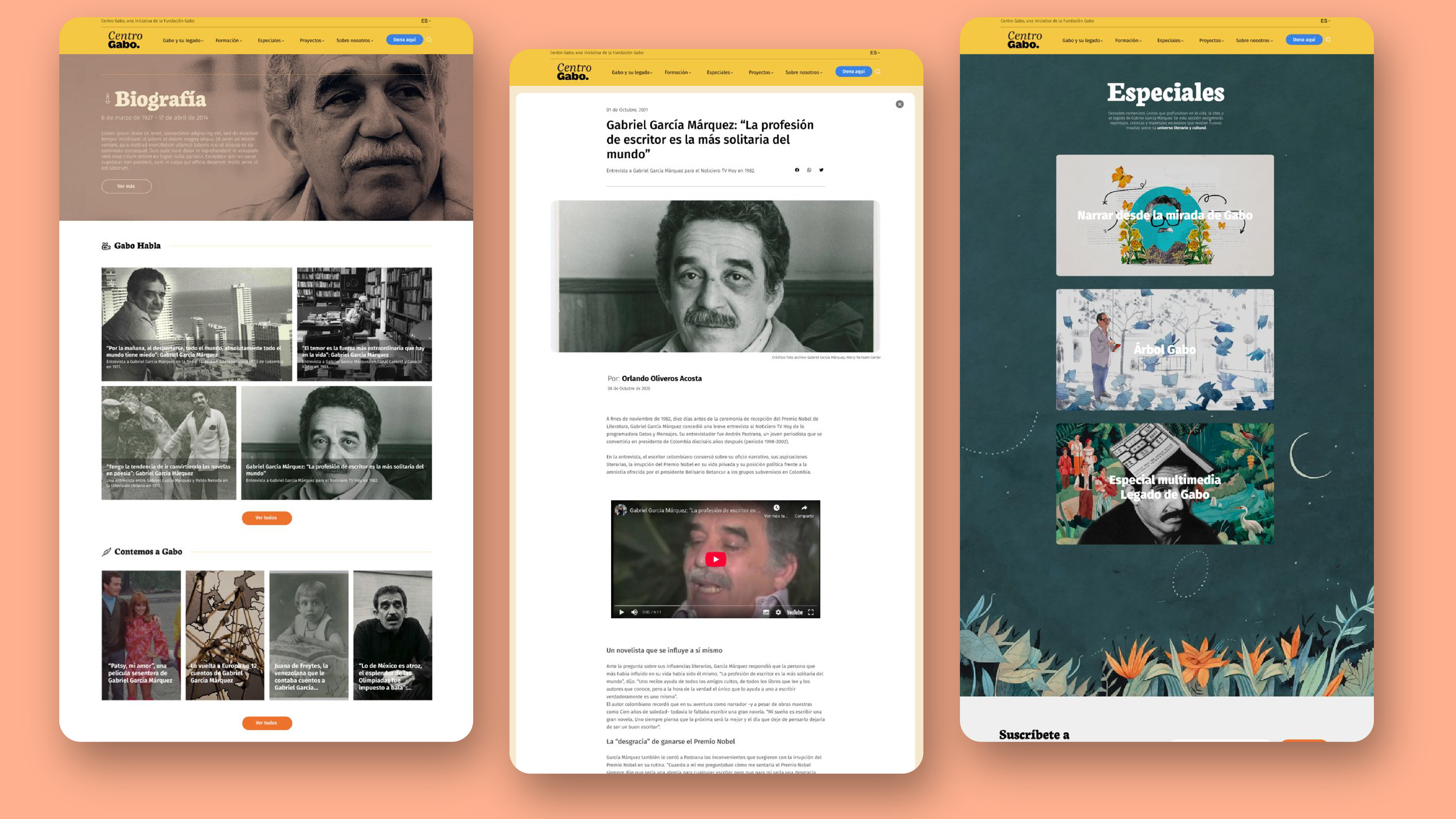
The Caribbean as a visual system
Creativity took shape through a color palette inspired by the Caribbean and the magical landscapes that run through Gabriel García Márquez's work. Intense yellows, deep blues, and earth tones helped build a warm, coherent, and immersive atmosphere.
These colors were not just an aesthetic decision, but also based on usability criteria, ensuring readability, contrast, and a comfortable visual experience across different devices.
Large, high-quality images to generate a great impact on users were the best ally.
From concept to interface: Figma as an ally
With that clear inspiration, it was time to build. I opened Figma, a key tool for structuring the project's architecture. Time was against us, but creativity was on our side. Every day I felt the project weaving itself together: a page that didn't just show information, but told a story. A digital tribute where every detail—a transition, a curve, a color—had intention.
Designing this page was more than a job; it was an experience that made me understand that designing is not just creating interfaces, it is transmitting emotions. I was able to pay tribute through my craft, creating a digital space where his magic lives on.
If you are starting out in the world of design, remember this: The projects that transform you come when you dare to design with your heart.